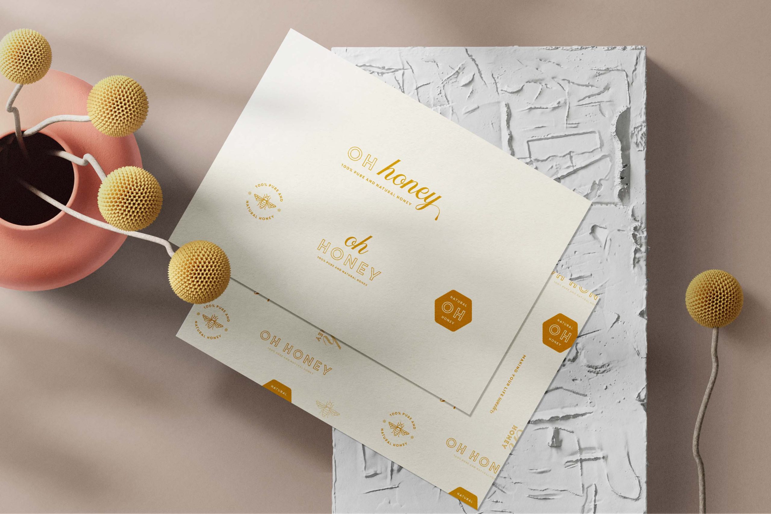

Without a doubt, your logo is the most important piece of your visual brand identity. But did you know, the modern world actually requires your brand to have multiple logo variations? If you think about it, there is your website, social media profiles, printed stationery or even packaging and there is no way one logo can suit all these dimensions! That is why it is important to have a professional set of logos that compliment each other and allow your brand to look consistent across all digital and print uses. In today’s post, I am going to give you an understanding on these logo variations and where to use them.
Logo variations are simply just different versions of your logos. You will have a primary logo and your brand identity designer will produce multiple arrangements of this logo to suit different purposes.
For example, if your primary logo is designed in a horizontal composition, your brand designer will create a more vertical composition to suit different formats. One thing to note, these logo variations shouldn’t be too different in terms of style as your brand still needs to be recognisable across platforms.
There are 3 main logo variations your brand identity designer should create that will allow your brand to stay consistent across all uses.


A primary logo is your brand’s main logo. This logo variation will contain the full brand name, any icons and some businesses like to include established dates or taglines. The primary logo should be used on your website header and on marketing material if it has plenty of space to fit.
I will always start off branding projects with the primary logo, and finalise this logo variation with a client before proceeding onto the others.
The secondary logo is arranged in a different composition to enable it to fit spaces that your primary logo will not. This logo will be in keeping with the rest of the brand identity but will only be used when needed.
I recommend stripping back this logo design so it’s a little more versatile and suitable for a variety of situations.
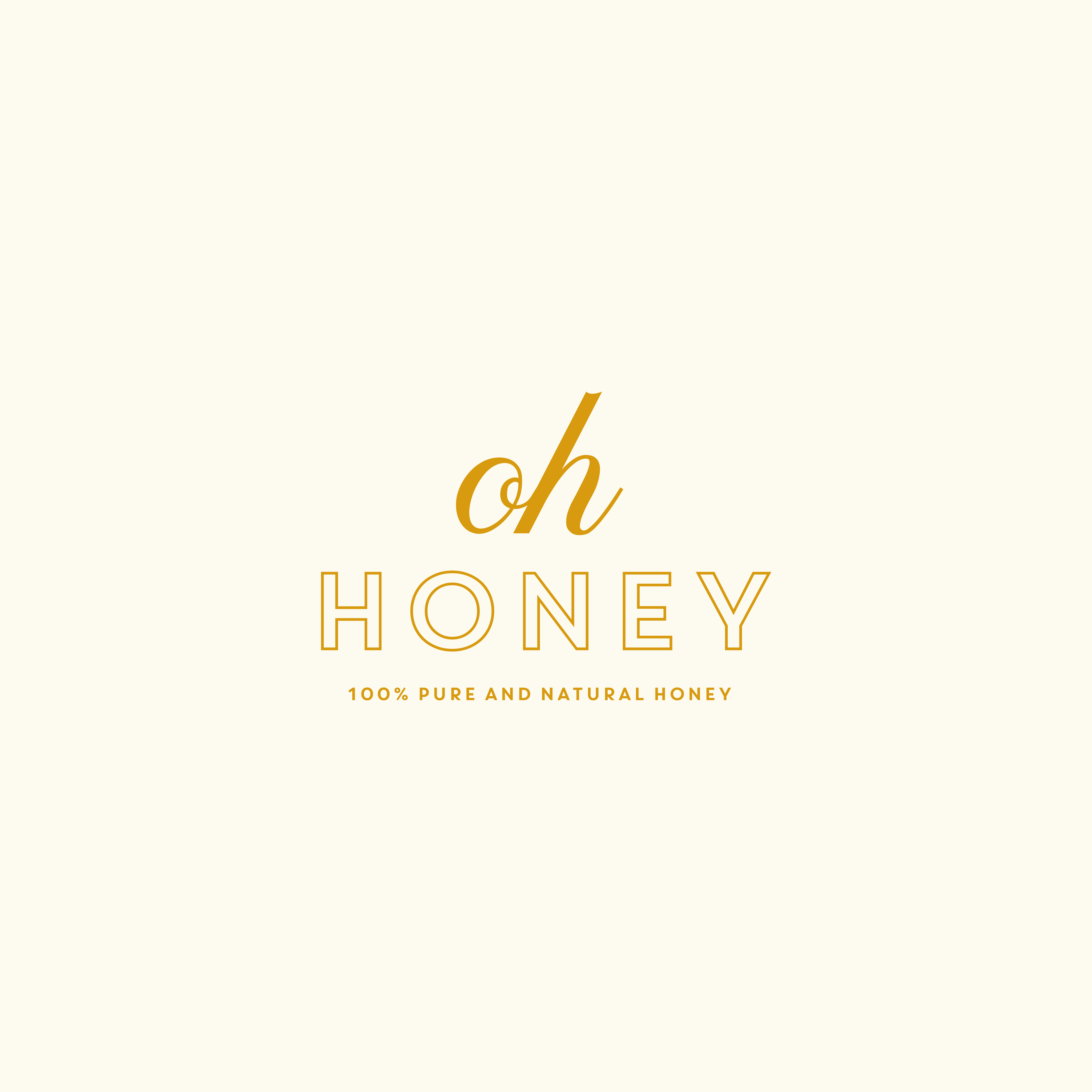


The submark logo is a much more simpler version of your primary and secondary logo and used for situations where you need a smaller format.
It usually contains letters, an icon or a symbol that represents your brand. It is commonly used as a social media profile photo, a favicon or even a watermark.
I like to offer my client variation when it comes to the submark so I produce 1-3 designs as it’s great to have options!
I hope this post has helped you understand the importance of having different logo variations & where you can use them. Consistent brand identity will not only enhance your brand awareness but it will help build strong connections to your customers.
Do you think you’re ready to brand or rebrand your business? Fill out my enquiry form & I can help turn your dreams to reality!
Are you ready to turn your dream into a reality?
Fill out the form below or email me directly at info@megstyles.co.uk